Brand development for Korean telecom ‘chaebol’
The European telecommunications market may be competitive, that is nothing compared to the same industry in Asia. Especially in megacities like Tokyo, Seoul and Hong Kong, the battle for marketshare is extremely fierce. One of the biggest players in that market, the Korean firm SK Telecom, needed a strong and really distinguishing visual identity for the mobile phone product. Bourne delivered a solid and versatile brand identity, and instructed the communication department in Seoul how to successfully implement it.
Brand development in Asia starts with a careful and thorough research of the attached cultural, national and corporate values. The huge multidisciplinary conglomerates in Korea, called ‘chaebol’, strongly cling to history and tradition but at the same time have a keen eye for future generations. A brand name and its visual identity need to resonate with the audiences and be in harmony with the past. And it needs to adhere to the larger, corporate values.
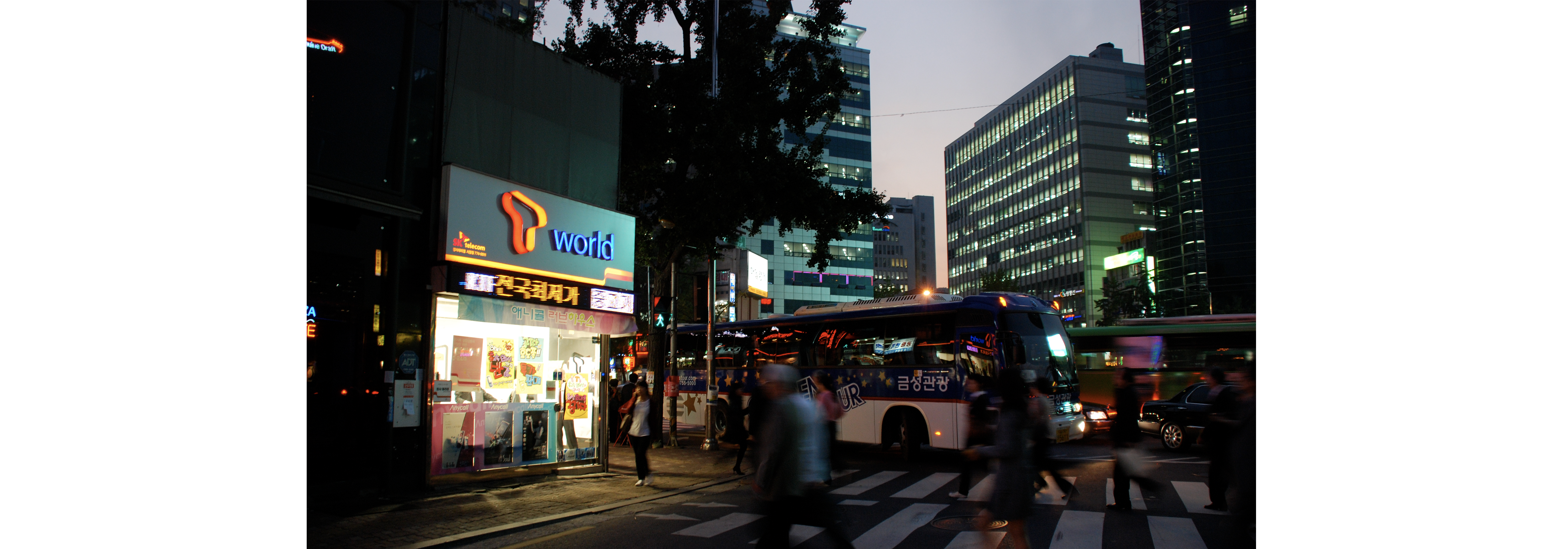
In this hectic environment, Bourne created the brand ‘T’. With SK Telecom, we piloted the brand together with a specially crafted custom typeface. Soon after the pilot we joined forces with the Korea based team to create a large number of applications, making sure the brand message came across consistently in all environments. In a minimum of time, the SK Telecom T brand was spotted on large highway billboards, in shiny neon in all major shopping districts of Seoul, in telecom shops, on merchandise, a brand magazine and before long in a number of T-lounges across town. About a year after the introduction of ‘T’, SK Telecom launched a new broadband internet service, simply called ‘B’.